


Symbol of Yin and Yang
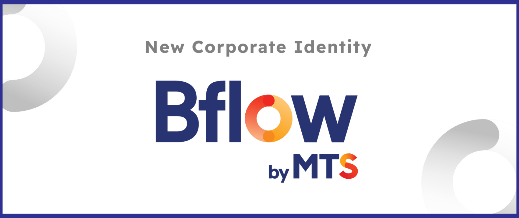
The Bflow logo was developed based on the Readex Pro font, creating a modern, solid style and also a symbol of unity, in line with the brand’s personality.
In particular, the letter O in Bflow is stylized according to the yin and yang symbol, representing the opposition and contrast between Yin (Yin) and Yang (Yang). Carrying the meaning of balance and similarity, symbolizing the cycle and flow of all-in-one data, with the modern Readex Pro font, contributing to the balance and consistency of a system. complete and unified system.

The MTS logo (Minh Tam Solution – the owner of Bflow products) is also stylized with the letter S from the idea of

Blue and orange add a moving effect, representing the powerful energy of technology and the balance of the yin and yang cycle.

Readex Pro font
The brand’s typeface, Readex Pro, exudes cleanliness and modernity, whether it’s a small piece of content or a large headline. This font maintains perfect balance in its letterforms, ensuring easy readability.